source("beginner_dispersion_and_dependence_tests.r")

# load packages
library(tidyverse)
library(haven)
library(ggplot2)

# Reading in the data
census_data <- read_dta("../datasets_beginner/01_census2016.dta")1.2 - Beginner - Dispersion and Dependence
econ 325
central tendency
descriptive statistics
variance
covariance
standard deviation
correlation
beginner
R
interquartile range
beginner
This notebook is to how data is spread out, and what that means for its interpretation. This includes both how individual values may vary, and how values may co-vary with one another.
Outline
Prerequisites
- Introduction to Jupyter
- Introduction to R
- Introduction to Visualization
- Central Tendency
- Distribution
Outcomes
This notebook explains the concepts of dispersion and dependence. After completing this notebook, you will be able to:
- Understand and interpret measures of dispersion, including variance and standard deviation
- Understand and interpret measures of dependence, including covariance and correlation
- Investigate, compute, and interpret common descriptive statistics
- Create summary tables for variables, including qualitative variables
- Parse summary statistics for meaning
References
Introduction
In this notebook, we will continue learning about how to use descriptive statistics to represent sets of data. We’ve already seen how to compute measures of central tendency and determine which measures are appropriate for given situations. We’ll now focus on computing measures of dispersion and dependence in order to better understand both the variation of variables, as well as relationships between variables in a data set. We’ll dedicate time to both measures, but we’ll look at dispersion first. Let’s first import our familiar 2016 Census data set from Statistics Canada.
Understanding Measures of Dispersion
Measures of dispersion describe the spread of data, that is, the possible values that a variable in a data set can take on. Common measures of dispersion which we’ll look at include the range, interquartile range, standard deviation and variance.
Range and Interquartile Range
Range: Difference between the maximum and minimum value that a variable takes on
Interquartile range: Difference between the 75th and 25th percentile values. We can use functions like
quantile()andfivenum()to calculate these statistics quite quickly.
Both functions return the same output: a list with different percentiles of the data. By default, these are the minimum, 25th percentile, 50th percentile (median), 75th percentile, and maximum values. In this way, these commands allow us to see both the spread of the middle 50% of data around the median (interquartile range), and the spread of the data in its entirely (range).
Variance
The variance is the average of the squared differences from the mean.
Small variance: observations tend to fall close to the mean
High variance: observations are very spread out from the mean.
The formula for the sample variance is:
\[ s_{x}^2 = \frac{\sum_{i=0}^{n} (x_i - \overline{x})^2}{n - 1} \]
The formula for the variance in a population is:
\[ \sigma_{x}^2 = \int(x - \mu)^2 f(x) dx \]
Standard Deviation
The standard deviation is the square root of the variance. It also measures dispersion around the mean, similar to the variance. For a sample this is:
\[ s_{x} = \sqrt{s_{x}^2} = \sqrt{\frac{\sum_{i=0}^{n} (x_i - \overline{x})^2}{n - 1}} \]
For the population:
\[ \sigma_{x} = \sqrt{\sigma_{x}^2} \]
For example, a normal distribution with
mean = 30andsd = 5is exactly the same thing as a normal distribution withmean = 30andvariance = 25.
We usually use standard deviation rather than variance. This is because variance does not have the same units as the original variable, while the standard deviation does.
Advanced Note: In econometrics, we use samples to estimate population parameters. Some samples have more information than others about the population.
For example, an estimate of the population variance based on a sample size of 100 certainly has more information than a sample size of 10.
We measure using the degrees of freedom of an estimate.
- The degrees of freedom for our estimate of variance (sample variance) is equal to \(n - 1\).
In R, we use the var() function to calculate the variance of a variable, and the sd() function for the standard deviation.
# calculate the variance of wage
variance <- var(census_data$wages, na.rm = TRUE)
We can illustrate the relationship between standard deviation and variance by taking the sqrt() of the variance:
# fill in the ... with your code below to find the sd of wages
answer_6 <- ...(var(census_data$wages, na.rm = TRUE))
test_6()
# fill in the ... with your code below to find the sd of wages
answer_6 <- sqrt(var(census_data$wages, na.rm = TRUE))
test_6()# recall the mean of wages
mean(census_data$wages, na.rm = TRUE) # remember that we need to remove all NA values otherwise R won't let us compute our summary statistics!
# calculate the standard deviation of wages
sd(census_data$wages, na.rm = TRUE) Interpreting Variation
Let’s say we’re interested in understanding how the wages variable was dispersed around the mean.
In the example above, we have a pretty large standard deviation, even larger than our mean! This tells us that most of the Canadians in the data set have a wage which lies approximately $64275.27 away from the mean of $54482.52.
This large standard deviation tells us that there is high variation in wages and that some of them are very far from the mean. This can be for many reasons, but one possibility is that we outliers in the data set: extreme variables of wages. This is common for wage distributions in the presence of income inequality.
General rule: the standard deviation is small when the data are all concentrated close to the mean, while the standard deviation is large when the data are spread out away from the mean.
Empirical Rule
Recall, from the Central Tendency notebook, that some data often approximately follows a normal distribution. For a variable with values distributed in this way, there is a rule used when discussing their standard deviation. This is called 68-95-99.7 rule or Empirical Rule:
- 68% of the values are within 1 standard deviation of the mean
- 95% are within 2 standard deviations of the mean.
- 99.7% are within 3 standard deviations from the mean
- Remaining values are outliers and incredibly rare.
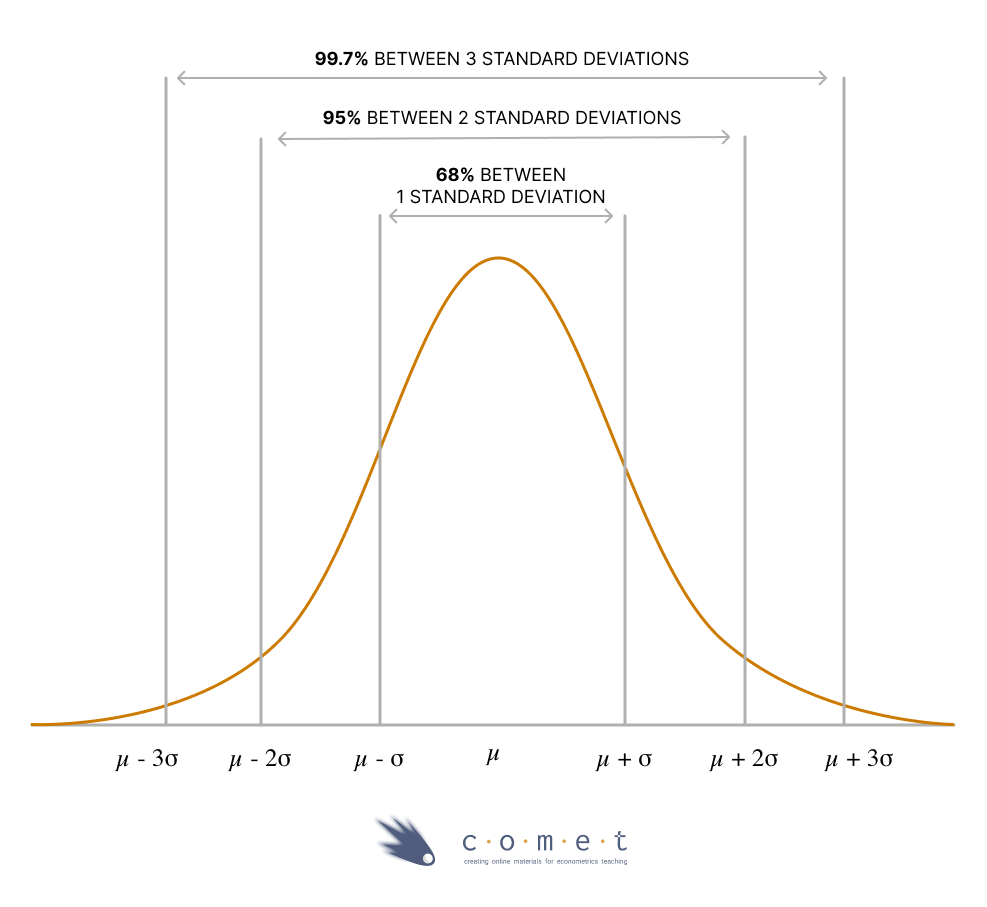
This gives us a helpful frame of reference when discussing the standard deviation of a variable. Although we already saw that the wages variable follows a relatively skewed distribution, imagine a variable that doesn’t.
For example: test scores. If the mean score on a test is 70 and the standard deviation is 10, this tells us that approximately 68% of students who wrote that test earned a score between 60 and 80 (1 standard deviation), approximately 95% earned a score between 50 and 90 (2 standard deviations) and virtually everyone earned a score between 40 and 100 (3 standard deviations).
Understanding Measures of Dependence
Measures of dependence calculate relationships between variables. The two most common are covariance and correlation.
Covariance
Covariance is a measure of the direction of a relationship between two variables.
- Positive covariance: two variables are positively related
- When one variable goes up, the other goes up, and vice versa.
- Negative covariance: two variables are negatively related.
- When one variable goes up, the other goes down and vice versa.
This is similar to the idea of variance, but where variance measures how a single variable varies, covariance measures how two vary together. They also have similar formulas.
Sample Covariance:
\[ s_{x,y}=\frac{\sum_{i=1}^{n}(x_{i}-\bar{x})(y_{i}-\bar{y})}{n-1} \]
Population Covariance:
\[ \sigma_{x,y}=\int\int(x_{i}-\mu_x)(y_{i}-\mu_y)f(x,y)dxdy \]
This is tedious to calculate, especially for large samples. In R, we can use the cov() function to calculate the covariance between two variables. Let’s say we’re interested in exploring the covariance between the wages variable and mrkinc variable in the dataset.
# cov() function requires use="complete.obs" to remove NA entries
cov(census_data$wages, census_data$mrkinc, use="complete.obs")
The calculated covariance between the wages variable and mrkinc variable in the dataset is positive, indicating the two variables are positively related. As one variable changes, the other variable will change in the same direction.
Let’s try computing the covariance “by hand” to understand how the formula really works. To simplify the process, we will construct a hypothetical data set with variables \(x\) and \(y\).
x <- c(6, 8, 10)
y <- c(25, 100, 125)
# Difference of each value and the mean for the variables
# Product of the above differences
# Sum the products
# Denominator is one less than the sample size
sum((x - mean(x))*(y - mean(y)))/(3-1)# Confirming the previous calculation
cov(x,y)Interpreting covariances directly is difficult because the size of the covariance depends on the scale of \(x\) and \(y\). Repeat the preceding calculation, but with variables that are 10x as large. What do you see?
x <- c(60, 80, 100)
y <- c(250, 1000, 1250)

cov(x,y)
The solution to this problem is the next topic: correlation.
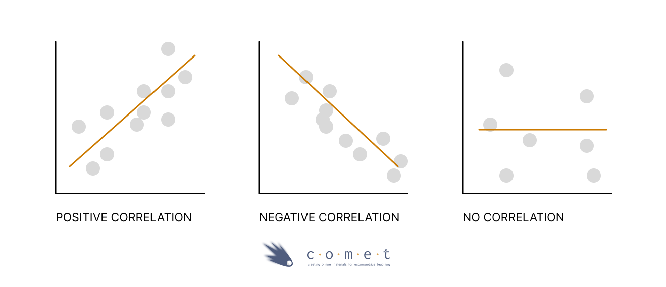
Correlation
A correlation coefficient measures the relationship between two variables. It allows us to know both if two variables move in the same direction (positive correlation), or in the opposite directions (negative correlation), or if they have no relationship (no correlation).
Note: even though a covariance or correlation may be zero, this does not mean that there is no relationship between the variables: this only means that there is no linear relationship.
Correlation fixes the scale problem with covariance by standardizing covariance to a scale of -1 to 1. It does this by dividing the covariance by the standard deviations. The most popular version is Pearson’s correlation coefficient which is calculated as follows in a sample.
\[ r_{x,y} = \frac{\sum_{i=1}^{n} (x_i - \overline{x})(y_i - \overline{y})}{\sqrt{\sum_{i=1}^{n} (x_i - \overline{x})^2 \sum_{i=1}^{n}(y_i - \overline{y})^2}}=\frac{s_{x,y}}{s_{x} s_{y}} \]
Once again, let’s try to compute the correlation “by hand” using the formula.
numerator <- sum((x - mean(x))*(y - mean(y)))
denominator <- sqrt(sum((x - mean(x))^2) * sum((y - mean(y))^2))
numerator/denominator
numerator <- cov(x,y)
denominator <- sd(x) * sd(y)
numerator/denominatorIn R, we can use the cor() function to calculate the correlation between two variables
# Confirming the previous calculation
cor(x,y)
To calculate the correlation between the wages variable and mrkinc variable in the dataset:
# cor() function requires use="complete.obs" to remove NA entries
cor(census_data$wages, census_data$mrkinc, use="complete.obs")
Now we have the number 0.8898687 \(\approx\) 0.89 as our correlation coefficient. What does it really mean?
A correlation coefficient ranges from -1 to 1, which tells us two things:
- The direction of the relationship between the 2 variables.
A negative correlation coefficient means that two variables evolve in opposite directions. If a variable increases the other decreases and vice versa.
A positive correlation implies that the two variables evolve in the same direction, that is, if one variable increases the other also increases and vice versa.
- The strength of the relationship between the 2 variables.
- The more extreme the correlation coefficient (the closer to -1 or 1), the stronger the relationship. The less extreme the correlation coefficient (the closer to 0), the weaker the relationship.
- Two variables are uncorrelated if the correlation coefficient is close to 0. As one variable increases, there is no tendency in the other variable to either decrease or increase.
Test your knowledge:
True or False? The correlation can measure linear relationships but the covariance can’t.
answer_5 <-  "..." # enter True or False

test_5()
We can also easily visualize correlation by plotting scatter plot with a trend line via ggplot() function.
ggplot(census_data, aes(x = mrkinc, y = wages)) +
       geom_point(shape = 1)
Adding a trend line to the scatter plot helps us interpret the directionality of two variables. We can do it via the geom_smooth() function by including the method=lm argument, which displays scatterplot patterns in the presence of overplotting. You will learn more about how trend lines are mathematically formulated in advanced econometrics classes.
ggplot(census_data, aes(x = mrkinc, y = wages)) +
  geom_point(shape = 1) +
  geom_smooth(method = lm)
Now we can see the apparent positive correlation!
Try it yourself!
Brainstorm some real-world examples that best demonstrate the correlation relationships below. The first one is already done for you!
- zero or near zero: the number of forks in your house vs the average rainfall where you live
- weak negative: [your text here]
- strong positive: [your text here]
- weak positive: [your text here]
- strong negative: [your text here]
Making Tables: Visualizing Results
Tables can be a useful way to generate large lists of different statistics that are relevant to your analysis.
census_data <- census_data %>% drop_na(wages)table2 <- census_data %>%
group_by(immstat) %>%
# we're intereseted in calculating different statistics based on immigration status
# (1 or 2: 1 = immigrant, 2 = non-immigrant)
summarize(avg_wage = mean(wages),
# this will calulate all statistics twice, once for each group
sd_wage = sd(wages),
median_wage = quantile(wages,0.5),
r_wm = cor(wages, mrkinc))
table2A Note on Reshaping Tables
These tables can be tough to read. Fortunately, R has a nice set of reshaping commands which allow you to reorganize these tables:
pivot_wider: turn selected row-values into columns (usually what you want to do)
pivot_longer: turn selected columns into rows
You do this by specifying what the new names and rows should looks like. Here’s an example, using the above table:
pivot_wider(table2,
            names_from = c(immstat),
            values_from = c(avg_wage, sd_wage, median_wage, r_wm),
            names_sep = ".") #the divider for new variable names
Practice Exercises
Exercise 1
Suppose the weights of packages(in lbs) at a particular post office are recorded as below. Assuming the weights follow a normal distribution.
package_data <- c(95, 130, 148, 183, 100, 98, 137, 110, 188, 166)# calculate the mean, standard deviation
# and variance of the weights of packages
# round all answers to 2 decimal places
answer_1 <- # enter your answer here for mean
answer_2 <- # enter your answer here for standard deviation
answer_3 <- # enter your answer here for variance
test_1()
test_2()
test_3()Exercise 2
Use the example above to answer: 68% of packages at the post office weigh how much?
- A - 68% of packages weigh between 65.30 and 150.70 lbs
- B - 68% of packages weigh between 100.40 and 170.60 lbs
- C - 68% of packages weigh between 120.40 and 150.60 lbs 4. D - 68% of packages weigh between 80.56 and 120.60 lbs
answer_4 <- "..."    # enter your choice here (ex, "F")

test_4()