# only run the following three commands if you have not already installed these packages
# install.packages("tidyverse")
# install.packages("haven")
# install.packages("ggplot2")

library(tidyverse)
library(haven)
library(ggplot2)

# load self-tests
source("beginner_central_tendency_tests.r")1.1.1 - Beginner - Central Tendency
econ 325
central tendency
descriptive statistics
mean
percentile
distribution
skewness
mode
R
beginner
median
dummy variable
This notebook is an introduction to basic statistics using Jupyter and R, and some fundamental data analysis.
Outline
Prerequisites
- Introduction to Jupyter
- Introduction to R
- Introduction to Visualization
Outcomes
After completing this notebook, you will be able to:
- Define the following terms: mean, median, percentiles, and mode.
- Calculate mean, median, and mode in R.
- Create boxplots to visualize ranges of data.
- Interpret and work with these statistics under various applications.
References
Introduction
In this notebook, we will introduce the idea of central tendency. In statistics, central tendency refers to the idea of how different interpretations of the term “middle” can be used to describe a probability distribution or dataset. In this notebook, we’ll think about central tendency in terms of numerical values which describe a given subset of data. This concept is important because we often deal with incredibly large datasets that are too big to describe in their entirety. In this light, it’s crucial to have summary statistics that we can use to describe the general behavior of variables. Before we continue, let’s import our familiar Canadian census dataset using the tools we’ve learned already.
# load the data
census_data <- read_dta("../datasets_beginner/01_census2016.dta")
Part 1: Key Concepts
Mean
The first, and most commonly referenced measure of central tendency is the sample mean (also referred to as the arithmetic mean). The mean of a variable is the average value of that variable, which can be found by summing together all values that a variable takes on in a set of observations and dividing by the total number of observations used. This is an intuitive measure of central tendency that many of us think of when we are trying to describe data. The formula for the sample mean is below.
\[ \overline{x} = \frac{1}{n}\sum_{i=0}^{n} x_i = \frac{Sum~of~All~Data~Points}{Total~Number~of~Data~Points} \]
For large datasets, using the formula above to find the mean by hand is impossibly inconvenient. Luckily, we can quickly calculate the mean of a variable in R as below.
# find the mean of market income (mrkinc)
mean(census_data$mrkinc)
Interesting! We see that the above code outputs NA. Why is this happening? Essentially, any time we try to perform operations to find statistics of central tendency for a variable that includes NA values, R will produce NA as the output. This is the case even if the data set only includes one observation recorded as NA for that variable. To account for this, we can simply filter our data set to remove these missing observations. We must do this when calculating any of the statistics introduced in this section, not just the mean. We do this below.
# remove missing values (NA values) in order to find the mean of mrkinc
census_data <- filter(census_data, !is.na(census_data$mrkinc))

mean(census_data$mrkinc)
Looking at the code above, the filter function takes in a dataframe and an argument. It then keeps all observations which return a value of TRUE for that argument. Here, we had to specify that is.na() be FALSE (i.e. !=TRUE) to keep observations for which there was no NA recorded on the mrkinc variable. This now gives us an actual answer for our mean: the average market income is about 59230.
Think deeper: notice that the mean only makes sense when we can add and divide the values of a variable. What kind of variable type is this appropriate for?
Median
Another common measure of central tendency is the median. The median is the value which exactly splits the observations for a variable in our data set in half when ordered in increasing (or decreasing) order.
Observation mrkinc |
60000, 45000, 72000 |
Median value mrkinc |
60000 There is exactly one observation above (70000) and one observation below (45000) this value. |
To find the median of an…
- Odd list: Order all of our observations in ascending (or descending) order, then find the value in the middle of this ordered list. Let \(n\) be the number of data points. If \(n\) is odd, then:
\[ Median = \frac{n+1}{2}th ~~ {data~point} \]
Even list: Take the middle two observations and take their arithmetic mean (sound familiar!). If \(n\) is even, then:
\[ Median = \frac{1}{2} \cdot [\frac{n}{2}th ~~ {data~point} + (\frac{n}{2} + 1)th ~~ {data~point}] \]
For large datasets, ordering all the values is basically impossible. We instead invoke the median() function to help us find our median quickly in R.
# find the median of mrkinc
median(census_data$mrkinc)
As we can see, the mean and median of market income in this census are not the same. This is quite common, and we will return to this idea of the mean and median being different a bit later on.
Think deeper: what kind of variable is the median appropriate for? Why?
Percentiles
As we learned, the median splits our dataset in half. In this way, 50% of our observations lie below the median, while the other 50% lie above. This brings us to percentiles: a percentile is a value on a scale of 0-100 (cent- coming from the Latin “centum”, meaning “hundred”) that indicates the percentage of a distribution that is at or below that value. Put another way, the \(n\)-th percentile of a variable is the number at which \(n\) percent of the recorded values lie to the left when all observations have been put in ascending order.
The median is necessarily the 50th percentile of any given variable. This is because 50% of the recorded observations for that variable lie below the median.
However, we can describe data with many more percentiles than just the 50th percentile. For example, we commonly refer to quantiles when describing data. Quantiles are equally divided sections of a distribution of values which together capture the full distribution of these values. They are thus a collection of percentiles which together must add up to 100.
Examples of quantiles:
Quartiles: the 0th percentile, 25th percentile, 50th percentile, 75th percentile, and 100th percentile
Quintiles: the 0th percentile, 20th percentile, 40th percentile, 60th percentile, 80th percentile, and 100th percentile
For instance, we may want to know what the 25th percentile of market income is in this dataset. That is, what is the value of market income for which 25% of the recorded observations for market income are less than this value. We can use the quantile() function in R to find this.
# find the 25th percentile of market income
quantile(census_data$mrkinc)
From our output, we can see that our 25th percentile is 22,000. That is, 25% of the people in this dataset have a recorded market income less than 22,000. Further, we can see that this general quantile() function outputs all of the quartiles of the mrkinc variable (including the 0th percentile, which we can interpret as the minimum value, and the 100th percentile, which we can interpret as the maximum value). This is the default format of the quantile() function. If we want to find specific percentiles, we can specify an additional argument to the function. For example, we may want to find the 33rd percentile of market income.
# find the 33rd percentile of market income
quantile(census_data$mrkinc, 0.33)
We may even want to find a series of percentiles. We can pass a vector to the quantile() function to achieve this.
# find the 40th and 80th percentiles of market income
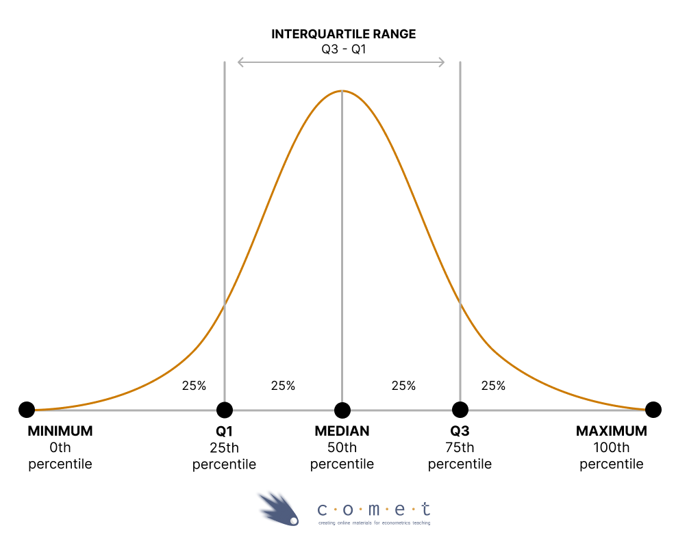
quantile(census_data$mrkinc, c(0.4, 0.8))The picture below helps to visualize percentiles more clearly. It includes quartiles and a series of other details, including the interquartile range, which is the difference between the 75th and 25th percentiles.
One incredibly helpful tool is Tukey’s five number summary; it includes the minimum, 25th percentile, median, 75th percentile, and maximum. To find this, we can call the fivenum() function, which takes in a set of data and returns the five statistics listed above. Try it below.
fivenum(census_data$mrkinc)Boxplots
Sometimes, we might want to visualize this summary in a diagram. We can use a visualization called a boxplot to graphically represent the central tendency, spread and skewness of numerical data. There are a variety of different variations of the boxplot, but in R the default is to create a diagram where:
The box represents the interquartile ranges; i.e., the 25th and 75th percentile
The bold line inside the box represents the median
The lines outside the box (called the “whiskers”) are the either the min and max, or 1.5 times the interquartile
- Values which exceed this distance are drawn as points, and are described as “outliers”
You can change this behaviour by setting
range = 0; in this case, the whiskers extend to the min and max, and the boxplot depicts the five number summary- The default is
range = 1.5
- The default is
To make this plot, we simply invoke the boxplot() function. This outputs a box which captures the interquartile range, with the median value marked as a bold line inside the box. In this way, the boxplot represents the quartiles of a dataset and how the data is distributed more generally.
# to make the boxplot look visually appealing, we remove income values above 120k and below 0
census_data2 <- census_data %>%
                filter(mrkinc < 120000, mrkinc > 0)

boxplot(census_data2$mrkinc)
fivenum(census_data2$mrkinc)
Mode
The last common measure of central tendency is the mode. The mode is the most common value a variable takes on in a dataset. For example, if a variable takes on values of 1, 6, 2, 3, 2, and 4, the mode of this variable is 2. If different values are equally represented as the most common value, there will be multiple modes. In this way, it is possible that the mode can be described as more than one value.
Let’s try the mode() function in R to see if we can find this statistic in our mrkinc variable.
# find the mode of mrkinc
mode(census_data$mrkinc)
We see that mode() doesn’t return a value for the mode, but instead returns the data type of the mode itself, which in this case is numeric. Unfortunately, R does not have a simple mode function like it does for the previous statistics. We must instead resort to either defining our own functions to find the mode, or even installing and importing new packages to help us. One possible method of finding the mode is seen below.
# create a function which finds the mode
findmode <- function(x) {
    ux <- unique(x)
    ux[which.max(tabulate(match(x, ux)))]
    }

# call this function to find the mode of mrkinc
findmode(census_data$mrkinc)
Bringing everything together
The mean is a stand-by measure of central tendency which tells us our average value for a variable. The median tells us what value splits our dataset in half for a given variable, while percentiles allow us to hone in on dissecting the distribution of values for a variable in our dataset in more detail.
It is perhaps unsurprising that R does not have an easy built-in function for finding the mode, given that the mode is generally much less useful than our other statistics. One way that the mode can be a deceiving statistic is in instances of top coding. This is where any values above a given threshold are reported as simply at that threshold.
Example: suppose the survey used to collect our
mrkincvariable offered a range of incomes for participants to select - but only up to 110,000 - after which, anyone with a market income higher than 110,000 was described as having an income of 110,000. This could make $110,000 by far the most commonly reported value formrkinc. In this case, the mode of the variable would be misleading. If you take ECON 326, you will see how top coding is dealt with, including by redefining these observations or dropping them altogether.
For these reasons, we will stick to the mean, median and percentiles as we move forward with applications and further elaboration. While it is important to understand what the mode is, we’ll not use it often in our general analysis of central tendency.
Test your knowledge
Find the mean and median values of wages, to 2 decimal places if necessary. Be sure to remove missing observations first.
# your code hereanswer_1 <- # your answer for the mean here
answer_2 <- # your answer for the median here
test_1()
test_2()Using what we’ve learned so far, graph the distribution of values of the wages variable. Use this graph to help you answer the following question: Which of the following measures of central tendency is most apt to report for the central tendency of this variable?
- mean
- median
- mode
# your code here# replace "..." with your answer of "A", "B", or "C"
answer_3 <- "..."
test_3()Think deeper: what characteristics of the distribution made you pick this answer choice?
What is the interquartile range of the wages variable?
# your code here# replace ... by the appropriate values
answer_4 <- c(..., ...)
test_4()Part 2: Applications and Additional Considerations
Now that we have a basic understanding of the main measures of central tendency, let’s look at their practicalities, both from a data analysis and R standpoint.
Distributions
As was alluded to earlier, the mean and median are usually not the same value. A clear case where they are the same, however, is when our data follows a perfectly symmetric distribution. This means that the probability of seeing any one value for a variable decreases in a near identical fashion outward from the 50th percentile (the median). As a result, the average value of the dataset is equal to its median value, meaning that the mean and median of the distribution are the same. One common example of this is the normal distribution, a classic symmetric distribution. We will delve further into different types of distributions in the upcoming notebooks. For now, you can run the code cell below to see an example of a standard normal distribution that we have randomly created using functions in R.
# don't worry about the specifics of this cell, just run the code.
set.seed(124)

x <- seq(0, 4, 0.1)

plot(x, dnorm(x, 2, 0.5), type = "l", xlab="", ylab="")
The above distribution is normally distributed and symmetric. We can see that the probability of seeing an observation with a specific value is largest at 2. Since the probability of seeing observations above and below it falls outward in a completely symmetric fashion, we should expect 50% of our observations to be above and below this point. We should also expect it to then be the average value. Thus, 2 is both the mean and median of the data. However, it’s important to note that most distributions in the real world are not normal.
Think deeper: what real-world variables might follow a normal distribution?
Let’s look at our market income variable for an example.
# plot the histogram of mrkinc
ggplot(census_data, aes(x=mrkinc)) +
       geom_histogram(bins = 100) +
       xlab("Market Income") +
       ylab("Number of Observations") +
       ggtitle("Histogram of Market Incomes")
This is a histogram. It shows us the number of observations with values in different market income groupings. From the output above, we can see that the data here for market income does not follow a nicely symmetric pattern. Instead, it appears that there are many more observations toward the lower end of market income (taller bars for each grouping), and then many much smaller groups extending far outward to the right end of high market incomes.
Skewness
The graph above is an example of a right-skewed distribution. A right-skewed distribution is an asymmetric distribution which has a long right tail for its histogram. Typically, a right-skewed distribution has a mean larger than its median. We can understand why this is the case by looking at the histogram above. There are many observations for small levels of market income (exemplified by the tall bar groupings on the left-hand side of the diagram). This means that many people have low market incomes. As a result, when moving from small to large values of mrkinc, the median appears quite quickly, which means the 50th percentile is a quite low level of market income. However, the mean will be much larger than the 50th percentile because the extremely high values will bring up the average of mrkinc. This logic aligns with the calculations for the mean and median we did earlier, wherein the mean was about $16,000 more than the median.
Unfortunately, we do not have any variables in this dataset which exhibit a left-skewed distribution, an asymmetric distribution which has a long left tail for its histogram. However, you can imagine exactly what would happen in this case. A long tail on the left-hand side of the histogram signifies many observations with high values recorded for a given variable. Thus, in this case, the median is much higher than the mean, indicative of the large value at which we finally reach the 50th percentile.
At this point, you may be wondering: if the mean and median are so often different, are they both useful measures of central tendency? The answer to this question depends on the situation. From the example with mrkinc above, we noticed that a large majority of individuals in the data set had a market income falling among the lower collection of values. Meanwhile, the mean was being artificially raised by the incredibly high market incomes of a few individuals in the outer right regions of our histogram. In this case, it makes more sense to report the median as a measure of central tendency, since it more accurately captures the income distribution of the vast majority of the population. This is why we often hear median household income reported as opposed to mean.
More specifically, we prefer to report the median here because a few values for mrkinc were outliers in our data set, extreme observations which are either much larger or much smaller than the other observations present. Outliers skew our calculation of the mean and pull it closer to the extremes, yet do much less damage to our calculation of the median, so we prefer to report the median when many outliers are present. Conversely, we can also simply remove the outliers from our data and then report the mean for our newly “untainted” distribution. This should be done carefully and only with justification. We can see how our histogram for mrkinc changes when this is done below.
# remove outliers from mrkinc (mrkinc > 150000) and plot a histogram of the results
census_data <- filter(census_data, census_data$mrkinc > 0 & census_data$mrkinc < 200000)

ggplot(census_data, aes(x=mrkinc)) +
    geom_histogram() +
    xlab("Market Income") +
    ylab("Number of Observations")
In all cases, a good rule of thumb is the following: if your data is symmetrically distributed and there aren’t any outliers, the mean is generally the best measure of central tendency. If your data is skewed (i.e. right or left skewed) or has many outliers, reporting the median is generally preferable. No matter what, we should always keep in mind our economic intuition of the variable and context when making the decision of how to report central tendency. We may even decide it is best to just report both, as well as the most commonly reported quantiles (typically quartiles).
Beyond the normal and skewed distributions we have generated above, there is one special distribution which, like the standard normal distribution, has an equal mean and median: the uniform distribution. A uniform distribution is a distribution in which every possible value for a variable appears with the same frequency, meaning, every value the variable can take on is equally likely to occur. This case is nice, since we don’t have to worry about choosing whether to report the mean or median when measuring central tendency: they are the same. Run the code cell below to see an example of roughly how a uniform distribution looks.
# plot the histogram of ppsort
ggplot(census_data, aes(x=ppsort)) +
    geom_histogram(bins=100) +
    xlab("ppsort") +
    ylab("Number of Observations")
The above uniform distribution is for the variable ppsort, a unique ID for each observation in our dataset. Since every bar grouping of ppsort has a roughly equal number of observations to match, we can see that the mean of this variable should be at about the halfway point of the distribution, which is also the 50th percentile (the median). Thus, our mean and median are roughly identical. However, the mean and median of ppsort are not economically useful. This variable is simply an identifier. It was chosen solely for visual purposes, since it is the only variable in the dataset which exhibits a roughly uniform distribution. Its mean and median do not inherently tell us anything important about this census dataset. This brings us to another important point: interpretation of measures of central tendency for different variables.
Interpretation of measures of central tendency
We often come across categorical variables. These variables take on discrete values, each of which represent specific “categories” or information for that variable. We cannot typically report the mean or median for those variables. This is because those variables do not take on a continuous range of numerical values. They instead take on either a discrete number of numerical values (oftentimes in no meaningful order and not evenly spaced), or they are hard-coded as characters on which no mathematical operations can be done. In these cases, our most meaningful measure of central tendency is to report the mode; if the number of categories is small enough, we may also simply choose to report the frequency (number of observations) for each category. In either case, plotting a graph such as a bar chart is a convenient way to both show the mode to us immediately (it will be the category with the most observations) and how many observations take on each categorical value. An example is below.
# plot a bar chart of pr (province of residence of respondents)
ggplot(census_data, aes(x=factor(pr))) +
    geom_bar(fill="purple") +
    xlab("Province of Residence") +
    theme(axis.text.x = element_text(angle = 90))
The graph above plots the frequency of each type of pr value, where the pr variable corresponds to province of residence. From this graph, we could see that the “mode” value of pr is Ontario. This makes sense because Ontario is the most populous province in Canada. If we were to try to “calculate” a mean or median for this variable, it would not mean much. Thus, for many categorical variables, we can present charts such as these to help determine the mode observation and also represent central tendency.
Dummy variables
There is one special type of categorical variable called a dummy variable. These are variables that take on one of 2 (usually arbitrary) values. Typically, they are the response to a binary question and represent an answer of “Yes” or “No” to that question. One example is the pkids variable. This variable takes on values of 1 and 0, which correspond to answers to the question “Does this individual belong to a household with any children?”
The value 1 represents the answer “Yes”, while 0 represents the answer “No”. To investigate this dummy variable more carefully, let’s remove missing observations as we have done before. In this case, using the glimpse() function, we can see that NA has been coded with the value 9, so let’s remove observations with this value. If you take ECON 326, you’ll get to work more with dummy variables!
# glimpse the function to see how missing observations are stored
glimpse(census_data$pkids)

# filter out missing observations for pkids
census_data <- filter(census_data, census_data$pkids != 9)
Now we have a variable which only takes on values of 1 or 0, the most common format for dummy variables. For these variables, the mean is quite interesting. Let’s find it below.
# calculate the mean of pkids
mean(census_data$pkids)
We can see that the mean of pkids is about 0.7. Let’s interpret this number: we are summing up individual values of 0 and 1, then dividing by the total number of observations we have in the data set. Since values of 0 will not factor into this addition, our final sum will capture the sum of all the 1s in the data set. This number is thus a representation of the number of people who responded “Yes” to the question “Do you belong to a household with any children?”. By dividing the sum by the total number of respondents, the mean represents the ratio or percentage of the data set who belongs to a household with children - about 70% of the respondents.
For dummy variables, the median is not very helpful, since it simply represents a value at which 50% of observations record a lower value. In this case, observations can only take on one of two values, so the median does not provide us much intuitive information. The mean is much more useful in this case.
Test your knowledge
Use the glimpse() function to inspect the newly created bilingual dummy variable, then use that variable to answer this question: what percentage of people in the dataset are bilingual?
# bilingual dummy variable
census_data <- census_data %>%
                mutate(bilingual = case_when(
                        fol == 1 ~ 0,
                        fol == 2 ~ 0,
                        fol == 3 ~ 1,
                        fol == 4 ~ 0))

# your code here
# enter your answer as a decimal (i.e., 95% = 0.95) and round to three decimal place
answer_5 <-
test_5()Use a graph to answer the following question: what is the most common age group of participants recorded in the dataset? Use the unique() function to help you see how each agegrp category is coded.
# your code here
unique(census_data$agegrp)
# replace ... with the appropriate numbers below
answer_6 <- "... to ... years"
test_6()Which is the most suitable measure of central tendency for the variables below?
veteranvariable wherein 1 indicates that the individual is a veteran and 0 otherwiseeducationvariable where there are distinct categories (i.e., High School Education, Bachelor’s Degree, Master’s Degree, etc…)heightvariable indicating the height of each individualwealthvariable indicating the net worth of an individual- mean
- median
- mode
Answer with a sequence of letters corresponding to the best measure of central tendency that would fit each of the aforementioned variables. For example: “AAAA”
answer_7 <- "..." # your answer here

test_7()