source("beginner_intro_to_data_visualization1_tests.r")1.5.1 - Beginner - Introduction to Data Visualization I
econ 325
visualization
ggplot
R
beginner
scatter plot
line plot
bar plot
histogram
exporting
raster image
vector image
How do we make visualizations of data? This notebook uses the
ggplot packages to help create impactful data visualizations using R. We will also discuss the rationale and principles of effective data design.
Outline
Prerequisites
- Introduction to Jupyter
- Introduction to R
- Be able to load data and packages in R
- Be able to create variables and objects in R
- Be familiar with the general syntax of R commands
Learning Outcomes
- Identify best practices for data visualization design
- Describe when to use the following kinds of visualizations to answer specific questions using a data set:
- scatterplots
- line plots
- bar plots
- histograms
- Use the
ggplot2package in R to create and refine the above visualizations using- geometric objects
- aesthetic mappings:
x,y,fill,color - labeling:
xlab,ylab,labs - font control and legend positioning: theme
- Describe the difference between vector and raster file outputs
- Use
ggsaveto save visualizations in.pngand.svgformat
References
- Timbers, T., Campbell, T., Lee, M. (2022). Data Science: A First Introduction.
- Metwalli, S. A. (2021, July 15). Data Visualization 101: How to choose a chart type. Medium. Retrieved June 10, 2022, from https://towardsdatascience.com/data-visualization-101-how-to-choose-a-chart-type-9b8830e558d6
Part 1: Understanding Visualization
Note: we use a substantial amount of charts in this notebook. If the charts are not rendering properly, try adjusting the following parameters in the plot codes: options(repr.plot.width = 15, repr.plot.height = 9).
repr.plot.widthis the plot width andrepr.plot.heightis the plot height.
Introduction
“The purpose of a visualization is to answer a question about a data set of interest.”
Timbers, T., Campbell, T., Lee, M. (2022). Data Science: A First Introduction.
In econometrics, good data visualizations should always…
- Answer a well-thought-out and relevant economic research question.
- Provide readers with a clear understanding of the research question and answer.
Questions to keep in mind:
- Who is our audience?
- What do they know?
- What is the question we’re trying to answer?
Not only are data visualizations incredibly important as narrative outputs from data analysis, they can also help us identify patterns or anomalies as we process our data.
Principles of design: data visualization DOs and DONT’s
DO use data visualization to tell the story of the data truthfully
DO remember that a visualization’s accuracy is only as good as the data is
DO label your axes in font sizes that are readable and use descriptive titles
DON’T choose colours that are very similar to each other when trying to distinguish 2 variables (red & blue > red & orange)
DON’T use design features (e.g., exaggerated scaling) to manipulate readers into believing a particular narrative of the data
Types of visualizations
The four following plot types we will be working with can all be found in the ggplot2 package:
Note: There are other plots that can be generated using this package which we’ll explore in Introduction to Data Visualization II. You can also check out R studio’s ggplot2 Cheat Sheet
- Scatter plot
- Visualizes the relationship between two quantitative variables
- Good for showing relationships and groupings among variables from relatively large datasets
- Line plot
- Visualizes trends with respect to an independent, ordered quantity (e.g., time)
- Good for when one of our variables is ordinal (time-like) or to display multiple series on a common timeline
- Bar plot
- Visualizes comparisons of amounts
- Good for comparing a few categories as parts of a whole or across time
- Histogram
- Visualizes the distribution of one quantitative variable
- Good for working with a discrete variable and visualizing all its possible values and how often they occur
Definitions adapted from: Data Science: A First Introduction.

Figure 1. Examples of scatter, line and bar plots, as well as histograms. (from Data Science: A First Introduction)
Loading data
In this tutorial, we will be working with the Penn World Table 10.0. This data is via:
- Feenstra, Robert C., Robert Inklaar and Marcel P. Timmer (2015), “The Next Generation of the Penn World Table” American Economic Review, 105(10), 3150-3182, available for download at https://www.rug.nl/ggdc/productivity/pwt/
To download the dataset we will be using for this notebook:
- Click the link provided above. The PWT page should appear
- Scroll down until three access options appear
- Click Stata and a Stata file (
.dta) should immediately download. Now move that file to your media directory and we can start the analysis!
Let’s start by importing the packages and data into our notebook. if you’re not sure what a variable represents, check out the documentation on the link above.
# import packages
library(tidyverse) # contains ggplot2, which is what we'll be using!
library(haven)

# load the data
pwt_data <- read_dta("../datasets_beginner/pwt100.dta") # make sure that the .dta file has this exact name

# declare factors
pwt_data <- as_factor(pwt_data)

pwt_data <- pwt_data %>%
    mutate(countrycode = as.factor(countrycode)) %>%
    mutate(country = as.factor(country)) %>%
    mutate(currency_unit = as.factor(currency_unit))

# check that it looks OK
# there will be a lot of missing data
glimpse(pwt_data)
As you can see, this data set includes 12,810 observations and many different variables.
How many variables are included in this data set?
Hint: variables are stored in columns
#Fill in the ... below with your answer to the above question

answer_1 <- ...

test_1()
Understanding ggplot2
R uses a “language” for how graphics are created called the grammar of graphics, which is a system of best practices from statistical visualization theory that centres data in the process.
Note: the
ggplot2cheatsheet is an important companion to this Notebook. This is a CC-by-SA Material from RStudio’s website
Layers with ggplot
In this “grammar” of graphics, we create a series of “layers” which implement a specific visual output:
- Identify a dataset from which we want to create our graph (
data=) - Associate variables in that dataset to aesthetics (
aes=)- Aesthetics represent different properties of a graph (e.g: “what goes on the \(x\)-axis”, or “what does the color of the line represent”). Each type of visualization is associated with a collection of necessary and optional aesthetic features.
- Attach a coordinate system and a plot type to the graph using
geom, which takes the aesthetics and describes them- This includes options like
positionwhich indicates how to combine elements (e.g. stack the bars in a barchart, or place them side-by-side)
- This includes options like
- Finally, tweak the visualization by adding labels or changing the colour scheme
Let’s see what this looks like in practice.
Interpreting the data
A few of the key variables represent the following:
rgdpe= expenditure-side real GDP (millions of USD)pop= population of a given country (millions of people)year= year of data recording (1950-2019)country= country being studied (183 countries are captured in this data set)hc= an index of human capital per person, which is based on average years of schooling and the return to educationemp= number of persons engaged in employment (millions)
Beginning our analysis
Let’s say we are interested in creating a visualization that answers the following question: How has real GDP per Capita changed over time in North American countries?
# First, filter the dataset to only include data on North American countries
NA_data <- filter(pwt_data, (countrycode == "CAN")|(countrycode == "USA")|(countrycode == "MEX"))

# We can take a look at our the rgdpe/pop variable by making a quick histogram here
histogram <- ggplot(data = NA_data, aes(x = rgdpe/pop)) +
             geom_histogram(colour = "black", bins = 20)
histogram
It looks like a solid number of GDP per capita measurements are under 20,000. Let’s get back to our main chart to find out what might be driving this!
# Use the ggplot command and specify the data frame that is to be used (NA_data in this case) and the set of plot aesthetics (which variables will be included)
plot <- ggplot(data = NA_data,  # this declares the data for the chart; all variable names are in this data
                aes(# this is a list of the aesthetic features of the chart
                    x = year,   # for example, the x-axis will be "year" (a continuous variable)
                    y = rgdpe/pop, # the y-axis will be expenditure-based real GDP per capita
                    fill = country, # this means that the country variable in our dataset will determine the colour of the bars
                    color = country # country variable will also determine the color of the borders or outline
                ),
                )

# Now, input the labels to the aesthetic features added above
plot <- plot + labs( # add human-readable, aesthetic labels
                    x = "Year",  # label for the x aesthetic (x-axis title)
                    y = "Real GDP per capita (expenditure-based)", #y-axis title
                    color = "Country", # adds the label "Country" to the legend and tells us which colour is used to represent which country
                    fill = "Country", # similarly, tells us about the colours used to fill
                    title = "North American Real GDP per Capita over Time") # and title of plot

# Because the variable "country" is expressed by colours, we are able to change the colours used in the chart using the commands below. Try playing with different palettes. To display other palettes use the command display.brewer.all()
plot <- plot + scale_fill_brewer(palette="Accent") #set the colour palette for fills
plot <- plot + scale_color_brewer(palette="Accent") #set the colour palette for outlines
options(repr.plot.width = 15, repr.plot.height = 9) #adjusts plot size: try playing around with the dimensions, and then return the values to width = 15 and height = 9

# Finally, input the type of vizualisation of the chart
plot1 <- plot + geom_col( # now we add the visualization geom_col() produces a bar graph)
                    position = "dodge") # this places the visualizations side-by-side
                                        # if you change position to "stack" it will be a stacked graph!
plot1
If we wanted to change the visualization and make this a line graph instead of a bar chart, we could do the following:
# fig.width = 40
plot2 <- plot + geom_line()

plot2 # show the plot
Let’s work through a few more examples together. We’ll also learn how to adjust text size in the next section as well!
Part 2: Building a Visualization
It’s important to note that we should build a visualization piece-by-piece and make adjustments along the way. Don’t worry about getting it completely right on the first try!
Let’s say we are interested in creating a visualization that answers the following question: What is the relationship between GDP per capita and human capital in the world today?
The first thing we want to do is identify what data we need:
- GDP:
rgdpeorrgdpo
Think Deeper: What’s the difference between using
rgdpeandrgdpo?
- Population:
pop - Human capital: variable
hc - Data from “today”:
year == 2019, the most recent data in our sample
Let’s start out by filter-ing the data to just get 2019 data.
figure_data <- filter(pwt_data, year == 2019)

head(figure_data$year)
Nice, it looks like we’ve got all the 2019 data! Let’s first consider what kind of visualization we want.
We are interested in the relationship between two quantitative variables - understanding how they move together.
While there are a couple of options, we’ll start with a scatterplot. If we consult our cheat-sheet, we can see that scatterplots are the geom_point() command. This requires the aesthetic properties:
x, the \(x\)-axisy, the \(y\)-axis
We then have other optional ones, like alpha, color, fill, shape, size, stroke see R studio’s ggplot2 Cheat Sheet.
Note: You can assign aesthetics on either the
ggplotlayer or on ageom. The only difference is that theggplotaesthetics are automatically inherited by all other layers. Generally, any aesthetic property which can be assigned inaes()can also be assigned to thegeomdirectly. For example, if you wanted to make a line dashed or a point red, you could do this by settinggeom_point(color = "red"). However, this will apply to all parts of thegeomso use it wisely!
Let’s start simple, and make x represent human capital, and y represent real GDP per capita. We can start our visualization by creating our ggplot object and assigning all these properties:
figure <- ggplot(data = figure_data, # associate the data we chose
                 aes(
                     x = hc,  # x is human capital
                     y = rgdpe/pop # we divide rgdpe by pop to get gdp per capita
                 ))

figure <- figure + labs(x = "Human Capital",
                        y = "Real GDP per capita (expenditure-based)",
                        title = "Global GDP per Capita and Human Capital in 2019") +
                        theme(
                            text = element_text(
                                size = 15)) #increases text size: try playing around with this number!

# note: you can set aesthetics to be simple functions of variables!
After running the previous cell, nothing was printed in our notebook; this is because we need to assign our visualization! Right now, it’s just data and properties. Let’s test it out by adding our geom_point() layer:
figure + geom_point()Nice! Now let’s make the size of each point relative to the population so bigger countries would be more prominent on the graph. We can do this by assigning the aesthetic again:
figure + geom_point(aes(
                    size = pop,)) # assigns the size of the point to be relative to the population values
Now let’s make the color of each point change as the employment (emp) rate changes so that darker colors would represent higher labour force utilization. Again, we can do this by assigning the aesthetic:
figure <- figure + geom_point(aes(
                    size = pop,
                    colour = 100*emp/pop))

figure
Great work! If we wanted to change the colours, we can set colours in R using palettes. The list of all the palette options are:
RColorBrewer::display.brewer.all() Let’s choose YlOrRed. We can apply this using the following (somewhat cryptic) command:
figure <- figure + scale_color_distiller(palette="YlOrRd")

figure

options(repr.plot.width = 15, repr.plot.height = 9)
Notice that we used color_brewer earlier and color_distiller here.
color_breweris for visualizations with discrete variables.color_distilleris for continuous.
As you see, building visualization requires lots of trial and error! Before and after doing a visualization, always ask yourself: “Is this effective? Is this what I want to do?”
Exporting Visualizations
Once we’ve decided that our graph can successfully answer our economic question, we can export it from Jupyter using the ggplot package with the following command:
ggsave: save a visualization using the following key arguments("file_name.file_format", my_plot, width = #, height = #)
Note: you can check out an expanded list of possible arguments at the R documentation page for
ggsave.
- The first part of the argument
"file_name.file_format"is where we decide on the name and file format to be saved in the Jupyter workspace.- You can add
"folder/file_name.file_format"to save to a specific folder: the format depends on the context you plan to use the visualization in. Images are typically stored in either raster or vector formats. See Data Science: A First Introduction.
- You can add
Raster images are represented as a 2-D grid of square pixels, each with its own color. Compressed raster images are “lossy” if the image cannot be perfectly re-created but differences are minimal. “Lossless” formats, on the other hand, allow a perfect display of the original image.
Common raster file types:
- JPEG (.jpg, .jpeg): lossy, usually used for photographs
- PNG (.png): lossless, usually used for plots / line drawings
- BMP (.bmp): lossless, raw image data, no compression (rarely used)
- TIFF (.tif, .tiff): typically lossless, no compression, used mostly in graphic arts, publishing
- Open-source software: GIMP
Vector images are represented as a collection of mathematical objects (lines, surfaces, shapes, curves). When the computer displays the image, it redraws all of the elements using their mathematical formulas.
Common vector file types:
- SVG (.svg): general-purpose use
- EPS (.eps): general-purpose use (rarely used)
- Open-source software: Inkscape
| Raster Image | Vector Image | |
|---|---|---|
| Pros | Takes the same amount of space and time to load regardless of the image’s content. | High quality image: you can zoom in/scale up without compromising quality. |
| Cons | May look “pixelated” when zoomed in. | May take longer to load depending on the complexity of the image. |
The second part of the argument,
my_plotspecifies which plot in our analysis we’d like to export.The last key part of the argument
width =andheight =specifies the dimensions of our image. If we haven’t made modifications to the size, these commands can be left out. Since we adjusted the graph output size usingoptions(repr.plot.width = 15, repr.plot.height = 9)we will specify these dimensions as we export.
Try uncommenting the code section below and saving our “Global GDP per capita and Human Capital in 2019” graph in the Jupyter directory that this notebook is stored in.
# ggsave("gdp_hc_plot.png", figure, width = 15, height = 9)Did you see a file appear in the directory? Now try saving the same graph as an .svg in the code cell below.
# ggsave("gdp_hc_plot. ...", figure, width = ..., height = ...)As we have seen, R makes it easy to create high-quality, impactful graphics. We’ll let you try it on your own now!
Test your knowledge
For this part of the notebook, we’ll build a chart together. The chart we’ll build is to describe the relationship between a country’s price level and its GDP per capita in 2019. A stylized fact of Economics says that countries with higher GDP per capita tend to have higher price levels, an effect we call the Penn Effect. Let’s check if that’s true in our data.
In this example, let’s focus on consumption - let’s use real consumption as a proxy for GDP and the price level for consumption as a proxy for the price level.
Note: the reason why the Penn World Table was created was to track those alleged differences in price levels across countries.
What variables from pwt_data do we need for this chart?
ccon,year,pop,avhccon,pop,pl_conccon,year,pop,rgdpeccon,year,ccon
#Fill in the "..." with "A", "B", "C", or "D" below

answer_2 <- "..."

test_2()
What is the most appropriate chart for this visualization?
- scatterplot
- line chart
- histogram
- bar chart
#Fill in the "..." with "A", "B", "C", or "D" below

answer_3 <- "..."

test_3()
Let’s get our data from pwt_data. Fill in the code below to select and filter the dataset.
pwt_data_clean <- filter(...) %>%
                    select(...) # only select the necessary columns

answer_4 <- pwt_data_clean # don't change this!

test_4()
Now, let’s start filling in the structure of our plot.
penn_effect_plot <- ggplot(data = ..., aes( #add your aesthetics below
                  x = ...,
                  y = ...)) +
                  labs(x = "Real Consumption per Capita (PPP)", # don't change the labels of the axes!
                       y = "Consumption Price Level",
                     title = "The Penn Effect (2019)") +
                  geom_...()+ # add geom function here
                  ylim(0,2)

answer_5 <- penn_effect_plot

test_5()
Cool! Now let’s just add a couple of more features to make it more effective (and prettier).
penn_effect_plot <- penn_effect_plot + geom_point(aes(size = pop)) + theme(text = element_text(size = 15)) + geom_smooth(method = 'lm', se = FALSE, color = 'darkblue')

penn_effect_plot

options(repr.plot.width = 15, repr.plot.height = 9)
It does seem like countries with higher consumption per capita are associated with higher price levels!
Now, you’ll make your own visualization using the Penn dataset. The topic of your visualization should be the relationship between the economic development of China and the United States over time.
Some variables you might want to consider are:
year: the year of observationrtfpna: total factor productivity (here’s a link, if your ECON 102 is rusty)rgdpe: real GDP (expenditure-based)pop: populationccon: real consumption of householdsavh: average hours worked
To be clear: you don’t need to use all of these variables in your visualization.
- Start by deciding what variables are essential and which ones are optional. Choose at least two to include in your visualization.
- Decide what kind of visualization you want to make. Relate your choices to the best practices for types of visualizations. See cheat-sheet for more.
- Finally, decide how you want to present it; what should the final product look like?
A good idea is to create it in layers, like we did before - updating as you go. We’ll start you off with some of the data and code scaffolding:
# my_data <- filter(pwt_data, (countrycode == "USA")|(countrycode == "CHN"))

# my_figure # give your plot a descriptive title
# <- ggplot(data = my_data, aes( #add your aesthetics below
#                 x = ...,
#                 y = ...,
#                 color = ...)) + # remember this is optional
#                 labs(x = "...", # what labels do you want to add?
#                     y = "...",
#                     title = "...") +
#                     theme(text = element_text(size = ...))+
#                 geom_...() # what geom will you use?  Does it need options?

#my_figure

# uncomment (delete the leading "#" symbol) to use these lines.
# Pro tip, you can uncomment an entire section by highlighting it and selecting "command + /"
See if you can piece together a decent graph from what you’ve learned so far. Depending on the direction you choose, your plot might look something like this one below. If you’re stuck, try to re-create this one, before starting on your own.
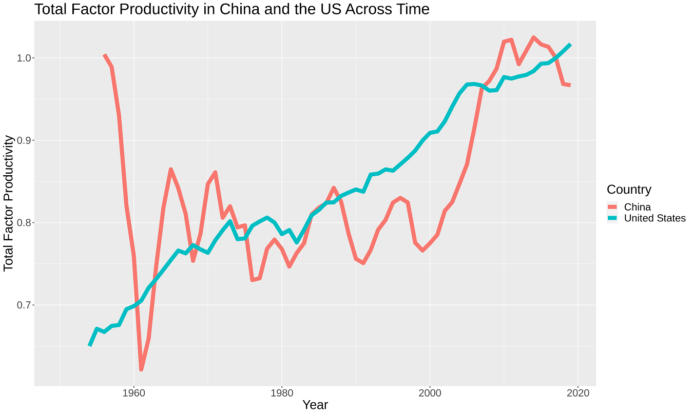
Think Deeper: why might China’s TFP be so volatile?
This visualization was made using the following features:
y = year,x = rtfpnageom_line()function with argument:size = 3in between the parentheses to make the lines a bit more visiblecolor = countryto create two unique lines on the graph for China and the USlabs(color = "Country")to give nice, human readable title to our color legend